I love challenges and I have loved being part of my new team on UKS and these are some of my favourite 'entries' from 2013 ....
I haven't made many double layouts since I started scrapping and this one took a bit of fiddling as it has lots of layers and I stuck them on crooked and had to pull them up and restick them. I also used the Xcut London die borrowed from Julie and used 2 die cut shapes on the layout. I took the buttons off in the end and then was really happy with it.
This is a challenge from September, following a sketch, I really like the colour combination used here though I don't always go for bright colours
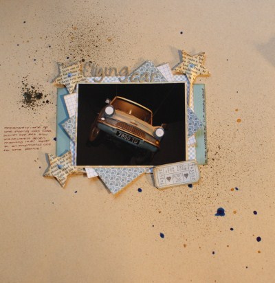
I made the star embellishments ( die cut vintage book paper on cocktail sticks) and created a simple layered messy stack on inky spritz kraft as a base..... the first Harry Potter Studio page featured here
I made another HP Studio page featuring the blue Ford Anglia in March and loved all the little bits and bobs added to the page
Ok, in April, another HP page showcasing the house that Harry grew up in, people commented on the brick stencil but it is actually a film strip die cut that I used to look like bricks.....clever!!
My final featured HP page, which was a scaplift from Shimelle I think, used up some 6x6 sheets and die cut shapes..... see the little people..... inked vintage book paper cut with a die
I was so so proud of this page as somehow it ended up featured on the UKS homepage! This was scraplifted from a LO I had made the year before. It documented a hospital admission with my son and I wrote how proud I was of him and how he had been handling his illness.
I really love this summer LO with photographs of the family on the Kamakaze water slide in Cyprus, the colours and the layering of all the paper elements worked so well, I must scraplift this one!
This page used up strips of scrap paper,some flowers, a few brads and a string of embellishments all in shades of blue.It immediately takes me back to the blue skies and blue sea from the boat trip we had in Antigua.
I love this page made in October as it immediately reminds me of watching the meteor showers in August, a young member of my family mistakenly called it a Metaphor Shower. Also used glittery letters which is a rarity for me but works so well with the topic.
I am looking forward to all the UKS weekly and monthly challenges and doing more with my fabulous team in 2014....hopefully we will have a team meet up and maybe a sleepover so we can all scrap together! Again I will plug UKS and suggest you go and have a look at all the inspiration over there and consider joining a team.


They are all Gorgeous! I love the double page spread -Just stunning! its years since I did one of those too. I love your HP pages - I was lucky enough to get on a school trip in December to look round - Wonderful!
ReplyDeleteSuper projects there. What a good idea to review your year's crafting.
ReplyDeleteSue x
A great selection of pages,Ruth.
ReplyDelete2013 really was such a creative year for you. Looking forward to seeing more amazing layouts from you this year
ReplyDeleteThese are lovely pages Ruth... I could comment on all of them but can see why your page of your son was featured on the UKS homepage, and I love the double lay out. I really must get my finger out this year and try and join in more. I have done some more lay outs myself and started my second 12 inch album! Yikes!!
ReplyDeleteWhat a great collection of pages Ruth. Being on a UKS team really does help the scrapping doesn't it! Love that you were featured on the home page (sorry I may have missed it at the time) - and well deserved. My fave of these pages is the Metaphor Shower - such a pretty page and that title!!!
ReplyDeleteLooking forward to seeing more of you in 2014 xxx
a great selection of your pages Ruth. Everyone is so lovely x
ReplyDeleteFabulous set of layouts..I really like the harry potter pages, which remind me to get my photos printed from our trip in October! My favourite is the 4 privet drive page with the sweet little house embellishments.
ReplyDeleteKaren x
Fantastic! I love the stars/HP and the first layout especially.
ReplyDeleterinda